Thanks to a Professional Development grant from the Greater Columbus Arts Council, Last month I took a letterpress printing class at the Phoenix Rising Printmaking Cooperative downtown. The class intrigued me because learning to set and print type would be part of a bigger final project: students would leave the class with a small limited edition book. It took me forever to finally sign up because I didn’t know what to make a book about. (?!) The class description suggested finding a quote to illustrate—or a poem—but no idea really clicked. Then I thought I’d make it about photographs, and set type to create small descriptions of the images. My Venice photographs maybe? or the ones from Paris? As the weeks went by, those ideas didn’t feel right.
One day as I was rummaging through my closet, I found some poems I’d written. They were tanka, a Japanese short form similar to haiku. I’d always thought they deserved something better than being stuck in a notebook forever. Hmm… this idea would not go away, so I figured it must be the right one. Maybe I could even find a few images that would work well alongside the poems…?

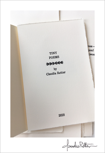
My artwork has always been primarily about photography, but here I had to choose the poems first. This was more difficult than I thought, because in the interest of brevity I couldn’t print all of them, so which ones would I leave out? After much thinking, some rewriting, and several index card rearrangements, I had a mockup of ten poems, 6 images, a title page and a colophon. When it came time to present my idea to our instructor, she was kinda like, “Well… you might get through one or two of those poems…” and then she showed me briefly what setting type actually looked like: you pick out one letter at a time and set them up in a little tray, but backwards from how you want them to print. Time-consuming didn’t even seem the word for it, ha!

Phoenix Rising is in the building on the left.
For a few days I thought about making something shorter and different, maybe a folio, or something partly hand-written… but when I tried taking out poems from the mix, it didn’t feel right. They all belonged together. I decided to heck with it: This book wanted to take this form as I envisioned it, and if it took me longer to finish, so be it. I showed up on the first day, ambitious and undaunted, and I started setting type. I realized how much we (I) take for granted working on a computer… Fonts galore! the click of a button changing size and line spacing! All these things are done on the letterpress by hand with physical spacers. I chose Century 12 serif, laying out bits of text and making pencil rubbings to see if I liked the spacing and size. Trial and error!

I got pretty good at finding letters (they’re not organized alphabetically in the printer’s tray— whaa??) and setting them in my poem rows. Because I was center-justifying the text, I had to make sure all my spacers were even on each side, and then use enough of them to make sure the whole finished block was even on all sides, holy cow. The whole thing then gets wrapped tightly with string while it waits to go to the press. I am totally tooting my own horn here when I proudly proclaim that I not only set all ten of my poems, but the title page and colophon as well. AND I printed all 10 copies. (I am all peacock-strutting around about this!)


Printing was fascinating too… you think, oh, I’ll just put my block where it needs to go, but then how does it stay put? You fill it in with spacers called “furniture” to keep everything tight, and it’s like being in kindergarten playing with different sized blocks, seeing what shapes will best fill in the gaps.

There’s a rhythm that settled in once I got used to it: Set up my paper, turn the handle, listen for the click, and then Marilyn, our instructor, would pluck it off the press and set it on a screen to dry while I set up the next sheet.


It was such a thrill to see my first poem roll off the drum. My poem! Even better was seeing a whole bunch of pages drying on the rack. My book! At first I was a little disappointed that the text looked almost bold. I’d chosen Rives BFK for my paper, and it’s velvety and porous, so ink just soaks right up and tends to spread and look a bit bolder than it would on a tighter paper. Not much I could do about it, so I just got used to it. Once everything was dry, I scored and folded pages and assembled them into the right order.

I then sewed them with a pamphlet stitch.

Each book is a single signature, folded in way so that two middle pages are “left out” and inserted into the folds of wrapped board covers. No glue required! I’ll be teaching this binding style as part of my adult education class at CCAD this January… let me know if you’d like to sign up :-)

There is still a lot of work to do, as part two of this project is about printing the images. To make it difficult on myself —Hey, it just wouldn’t be me if I didn’t pick the most complicated, time-consuming processes! — I am opting to make individual photogravures on rice paper which I will then tip onto the pages. I struggled with this choice. Yes, I could just print them digitally (good grief it would save so much time!) but aesthetically, it felt right to pair letterpress with gravure: rollers and ink for everything.
More to come…

Thank you, Marilyn and again, a HUGE thank you to the Greater Columbus Arts Council! My city rocks.